Media
How photos and screenshots are carried: a carousel on the home hero, a flat green-railed phone frame for app screenshots, a full-screen zoom for diagrams and images, and a placeholder for specimens.
Post hero illustrations
Every post opens with a rich but flat isometric illustration: detailed, layered vector scenes with no gradients, no readable text and no logos, on a soft near-white ground. Each one is generated with Cloudflare AI from a short written concept describing the post’s idea as objects — a tab bar pulling in panels, a mesh sorting arrows into trays.
The model never chooses the palette. Every illustration picks a few colours from one shared ten-colour pool — the brand lime, then navy, coral, teal, plum, amber, blush, sky, charcoal and sand — and the lime accent is always among them. So no two heroes wear quite the same mix, but every one stays inside the same family.
The palette and the series grounds are documented with the rest of the colour system on the Colour page.
On an article page the hero sits on a blurred, enlarged copy of itself, a backdrop band that adapts to any aspect ratio; phones drop the blur and show the image plain. Tall screenshots in prose render at half width, capped at 340 pixels, so a phone-shaped image never towers over the text.
Carousel
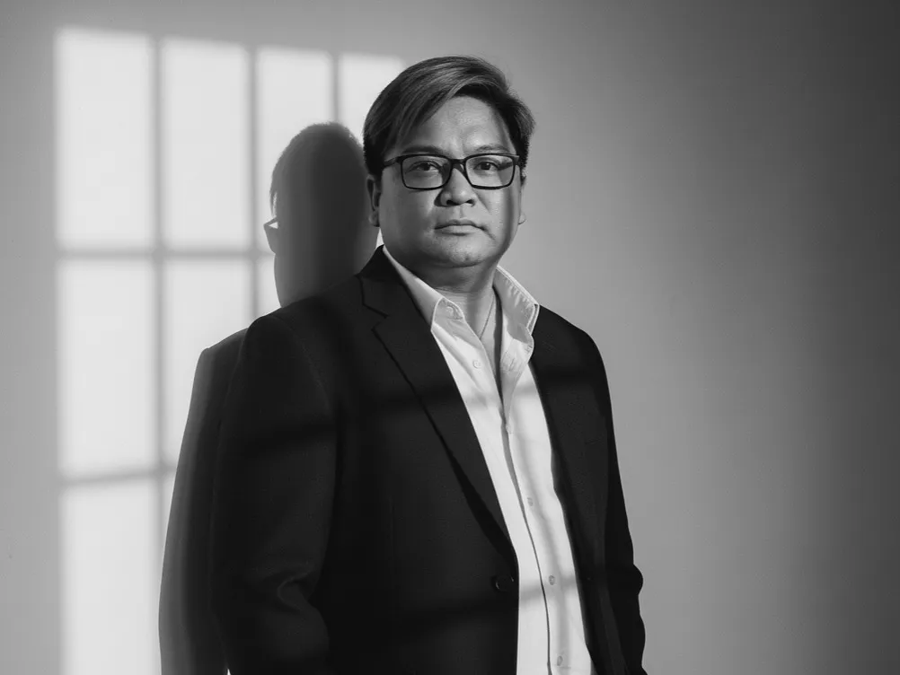
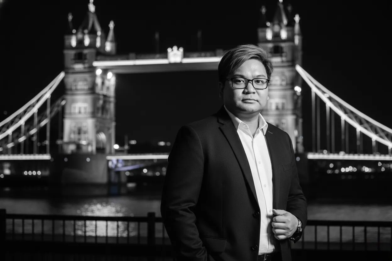
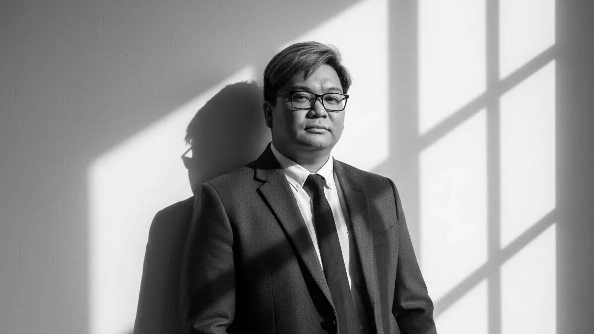
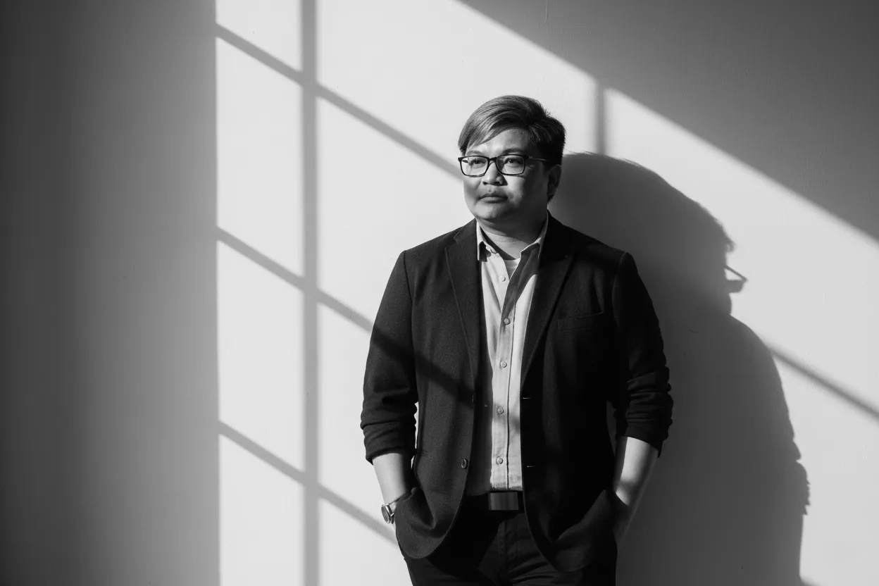
The home hero's photo carousel, rendered live: arrows and a counter on the frame, a dot row beneath it from 700 pixels (the active dot stretches to a pill), swipe on touch, and autoplay that respects reduced motion and pauses from the control beside the dots. On a phone the dots give way to an overlay title on the photo.



Device frame
App screenshots in articles sit inside a flat phone frame drawn in CSS: a brand-green rail, a thin black bezel, side buttons drawn just outside the rail, and a theme-aware shadow. It holds to the blog's flat aesthetic rather than a photoreal render.
Full-screen zoom
Images and diagrams in articles open in a full-screen lightbox on tap — the one overlay that behaves the same on every device. Diagrams re-theme inside it, so a dark-mode reader zooms into a dark-mode diagram.
Placeholder
Specimens on these docs that would carry a photo use a neutral placeholder rather than a borrowed image, so the layout is honest about what is content and what is chrome.