What the panel sees, and what they don’t
A 7-page PDF attached to an email. That’s the entire surface area the hiring panel ever touches. Not the wizard, not the timers, not the auto-save or the keyboard shortcuts or the colour-coded scores. The app exists for one person: the interviewer, during the call.
The PDF carries the work: scores, notes, strengths and growth areas, the hire/reject decision, and four appendices of evidence. Everything the panel needs to make an offer or move on.
Most hiring panels won’t sit down with a code-review tool, and it’d be a strange ask if they did. Their job is the decision, not the data entry. The app’s job is to make sure the data on the page is worth their attention.
Getting there took three attempts and a bug that nearly cost a candidate their score.
The format problem
I designed the scorecards for our React Native hiring process earlier this year. Three assessments: a 100-check code review, a walkthrough interview scored 1 to 5, and a behavioural interview mapped to our five values. The scoring worked. The format I was using to capture those scores during a live call did not.
The walkthrough interview is the hardest piece. A candidate is sharing their screen, talking you through the tech test they’ve built, explaining their decisions. I need to read a scripted question, listen, score it 1 to 5, write notes, check the time, then move to the next one. All while keeping eye contact and the conversation natural.
Try that in a markdown table in VS Code. The cursor lands in the wrong cell. The scroll position drifts. The candidate hears you typing and slows down.
Three attempts
Notion was my first thought. I use it for everything personal. It’s not a tool we use at work, though, and building on a platform I’d be the only one using felt like a dead end. I dropped it before starting.
Markdown files came next. One .md per scorecard, tables for scores, space for notes. The code review worked well this way. 100 yes/no checks you complete after the interview at your own pace. The walkthrough and behavioural scorecards needed to work during the call, and the markdown got in the way. Finding the right row, typing a number, scrolling to the next section. Accurate, but slow. I was spending more attention on the document than the person.
After the interview was worse. Three separate markdown files in three different formats, manually stitched into one coherent document for the recruitment team. Every time, it took longer than I wanted.
The third attempt was a localhost React app. No backend, no database, no deployment. Just npm run dev and a browser tab. Everything persists in localStorage. The app dies when I close the tab and comes back when I open it again.
Staying present during the call
The whole point was to stop fighting the tool during the interview. Three things made the difference.
One question per screen. The walkthrough is a wizard. Each step shows the script to read aloud (in a blue blockquote so I can find it instantly), the questions with large 1 to 5 buttons, and a notes field. No scrolling. No hunting for the right section. Press “Next” and the next group appears. For senior candidates, the wizard extends from 4 steps to 8 with an additional Part B on system design.
Keyboard scoring. Press 1 through 5 and the score registers immediately. No clicking, no dropdown menus, no confirmation dialogs. My eyes stay on the video call. The scoring happens in my peripheral vision.
A section timer in the corner. Not a countdown, just a quiet elapsed-time display. I glanced at it during the first walkthrough and realised I’d spent 8 minutes on a section that should take 4. Without it, I’d have run over and cut the last section short. The candidate would have lost the chance to answer questions that could have lifted their score.
The bug that scored everyone the same
The stack was React 19, TypeScript, Vite, Tailwind v4. The first version had no state management library: a custom useLocalStorage hook and React Router.
During testing, I scored a candidate’s walkthrough end to end. Every section, every question, full notes. I pressed “Next” to the summary screen and saw every section had the same score: whatever I’d entered on the last step.
A stale closure bug. Each wizard step’s useCallback captured the walkthrough data from the previous render. When step 3 saved, it overwrote steps 1 and 2 because it was still holding the old state. The classic React problem where state inside a callback doesn’t update when you think it does.
The fix was to stop trusting React’s view of the data on writes. Every mutation reads the current candidate state directly from localStorage rather than from a captured closure. A freshCandidate() helper that hits localStorage.getItem on every save. Not elegant. Works every time.
function freshCandidate(id: string): Candidate | undefined {
  const raw = localStorage.getItem('ik-candidates');
  if (!raw) return undefined;
  return JSON.parse(raw).find((c: Candidate) => c.id === id);
}
The same pattern repeats across three hooks: useWalkthrough, useBehavioural, useCodeReview. Each one reads fresh, writes fresh, and dispatches a custom event (ls-sync) so other hook instances pick up the change. Twenty lines of persistence code. No Redux, no context providers, no middleware. Those twenty lines ran the first real interviews; the store was later formalised on Redux Toolkit as the app grew, but that’s a different post.
The PDF nobody sees me build
After the interview, I press “Print / PDF” and the browser generates a Candidate Assessment Report. No PDF library. Just print CSS.
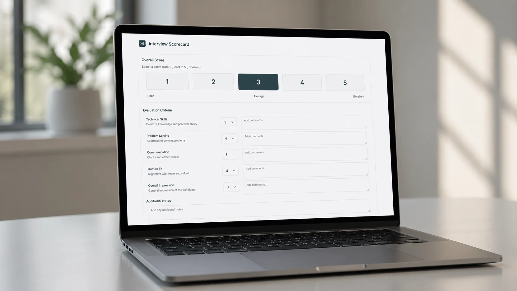
Page 1 is the summary: a score table, the recommended level band, the hire/reject decision, and the offer level. Pages 2 and 3 show strengths and growth areas pulled from all three assessments, grouped by source. Then four appendices: code review breakdown, walkthrough scores with every question and note, behavioural scores by value, and a level bands reference table with the candidate’s band highlighted in navy.
That level bands table maps the combined score to one of 12 tiers: Graduate 1 through Senior 2+. (The four bands from the scorecard post got subdivided into three tiers each once real candidates started landing between them.) The 2+ tier is deliberately hard to reach. It marks someone at the very top of their category, pushing into the next. When a panel member sees “Associate 2+” on the PDF, the read is immediate: strong Associate, not quite SE. That single label carries more signal than a paragraph of justification.
The behavioural gate adds a second check. A candidate scoring below 10/25 on values doesn’t proceed, regardless of their technical score. Between 10 and 14 triggers a panel discussion. 15 or above clears the gate. Technical skills can be taught. Values mismatches create problems that grow over time.
Print CSS is its own discipline
I wrote more CSS for @media print than for screen. It’s the part that surprised me the most.
The navy background on the combined score box? Doesn’t print. Browsers strip background colours by default. I had to convert it to a white box with a heavy black border using [style*="background: #002147"] selectors in the print stylesheet. Tailwind utility classes like bg-white get targeted with attribute selectors ([class*="bg-white"]) to override padding, borders, and margins for print.
page-break-inside: avoid is a suggestion, not a command. The browser will break inside an element if the alternative is a mostly-empty page. I spent an hour debugging why a strengths section split across two pages before I realised the content was simply too tall for the remaining space.
Heading styles needed explicit inline border-bottom because Tailwind classes get stripped or overridden by the print reset. Font sizes switch from rem to pt. Interactive elements (textareas, checkboxes, dropdowns) are hidden. The entire print layout lives in a separate CandidatePrintReport component that renders inside hidden print:block. Clean separation. The screen never sees the print layout, the print never sees the buttons.
If I built this again, I’d design the print layout first and the screen layout second. The PDF is the artefact that matters. The screen is the input form.
What I’d change
Tests before scoring logic. Red flag deductions, stretch bonuses, level band lookups, the behavioural gate threshold. These are pure functions now, extracted into utils/scoring.ts, and they’re the kind of code that breaks silently when you tweak a boundary. I wrote them last. They should have been first.
The markdown import parser is fragile. It uses regex to read Y/N values from scored code review files. It works for the specific format I designed, but a different table layout or an extra column breaks it. A proper parser with error recovery would hold up better.
Accessibility was added late. WCAG AA compliance (per-route page titles, heading hierarchy, colour-contrast ratios, roving tabindex on score selectors, aria-live on save indicators) was retrofitted rather than built in. It all passes now. It would have been cleaner to build accessible from the start. Internal tools deserve the same standards as public-facing ones.
The real test
I used this app for the first time in an actual interview last week. The candidate didn’t know I was using anything unusual. They presented their take-home submission, I scored, we talked. No scrolling, no typing into markdown tables, no losing my place. After the call, one button press and the PDF was ready.
That’s the whole point. The best interview tool is the one the candidate never notices. The scoring, the timers, the level calculations, the PDF generation: all of it should sit out of the way. The panel reads the PDF. The candidate has a conversation. The tool stays quiet between the two.